Visual analytics: from CRM data (and beyond) to the dashboards the management understands at first glance.
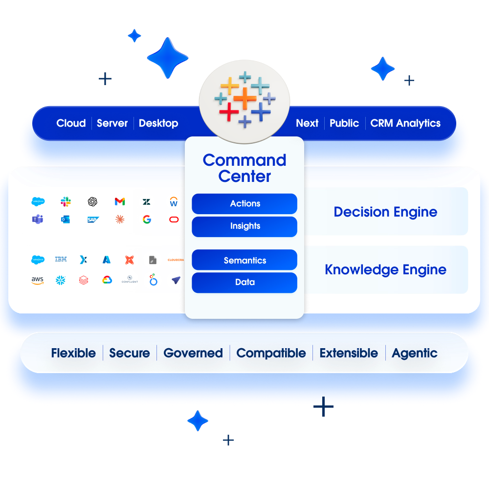
Tableau turned analysis into a visual gesture: you drag, and the right chart appears; you ask, and Tableau Pulse (with AI) tells you what changed and why. It connects to everything — Salesforce natively, but also SAP, databases and warehouses — and the dashboards live where needed: web, mobile, inside the CRM.


Few views per decision, not an amusement park of charts: the design starts from the management's questions.
CRM sales + ERP revenue + costs: the whole truth, reconciled.
Certified data sources and permissions: free exploration on the right numbers.
Pulse on mobile: the changing number arrives by itself, every morning.
Tableau translates the gesture into queries with VizQL: exploration is direct on the data (live or Hyper extracts); Prep cleans and models the flows; certified data sources publish governed models; row-level security follows the user; Pulse delivers the metrics with automatic natural-language insights; the Salesforce (and Agentforce) integration puts the vizzes inside the CRM. Server or Cloud, the governance is the same: projects, permissions and certifications.
Pipeline, forecast and network performance in one view.
Deliveries, stock and quality monitored at a glance.
The monthly pack that updates itself.